

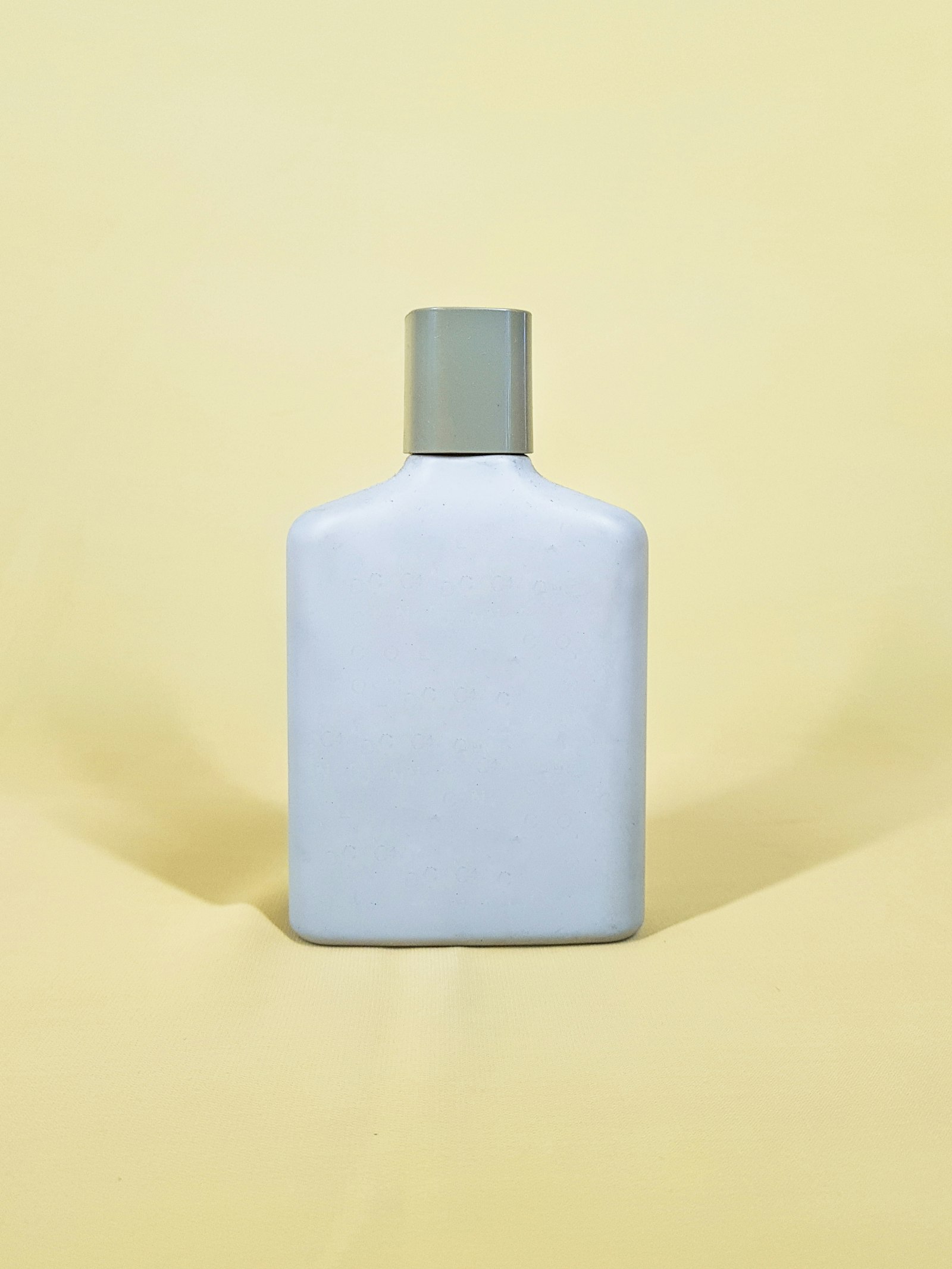
Plastic parts get their color from masterbatch: small pellets carrying a concentrated pigment load, typically 20 to 40 percent pigment by weight, blended into natural resin. The masterbatch is dosed into the molding machine at a let-down ratio, commonly 2 to 4 percent, through a doser mounted on the press. A Pantone number tells the colorist what target to hit. It does not, by itself, tell the machine how to hit it. Getting from a swatch to a matched part is a separate formulation and dosing exercise.
Natural resin is not neutral: natural HDPE carries a slight milky opacity, natural PP leans more translucent, and natural PET is closer to true clear. The same masterbatch dosed at the same ratio produces a visibly different result depending on which resin it is going into, because the base material is already contributing its own tint and opacity to the mix. PCR content shifts this further. Reprocessed HDPE and PET commonly carry a gray or amber cast depending on the source stream, which means a color match built on virgin resin can drift once PCR content is introduced, sometimes needing a higher pigment loading to compensate. For a broader look at how these resins differ beyond color, see PP vs. HDPE vs. PET: Choosing the Right Resin.
Color and opacity are properties of the finished wall. A thin wall transmits more light through the part, which reads lighter and slightly more translucent than a thick wall molded from the exact same resin and colorant. This is why a flat color chip serves only as a starting reference. A color match has to be validated on an actual molded part at the part's real wall thickness before it is signed off. Wall thickness itself is set by the molding process. See Injection Molding vs. Blow Molding for how that decision gets made.
Color matching is measured with a spectrophotometer against a Delta E value, a numeric measure of the visual difference between the target and the sample. A Delta E under 1.0 is generally imperceptible to the eye, and most commercial cosmetic packaging programs target somewhere in the 1.0 to 2.0 range as an acceptable match. Lighting also matters here: a color that reads as matched under daylight-standard viewing can look off under warm retail lighting or fluorescent factory lighting, an effect called metamerism. A tight Delta E on paper does not fully substitute for viewing the actual sample under the lighting conditions the product will be sold in.
The first shot off a new color match is a trial. Pigment dispersion, screw mixing consistency, and dosing accuracy all need a live production run to validate. Expect at least one color-correction pass between the first shot and full production approval, and build that into the program timeline.
A color match should be run against a submitted Pantone solid coated reference and verified with spectrophotometer readings, with a physical first-shot sample held for approval before full production begins. PCR content and matches to an existing SKU already in market both change the pigment loading required to hit target, which is worth accounting for at the outset.
The same masterbatch discipline applies whether the program is a cosmetics SKU or a commodity and industrial run. Request a quote with the Pantone reference and target resin.